Google Translate
A shared room that keeps context alive across devices, because context is what makes a translation accurate.
The problem
Google Translate handles words well and conversations badly. In Turkey I watched it fail in the small moments: an idiom lands wrong, a reply arrives without knowing what came before it, and both people end up double-checking every sentence before they say it. Family and friends described the same thing in shops and restaurants. The instinct is to blame the translation, but looking closer, the machine was not short of vocabulary. It was short of context. Each phrase arrived alone, with nothing before it to settle what the speaker meant. That reframing decided the whole project: I was not going to make the model better, I was going to give it something to work with.
“It was not short of vocabulary. It was short of context.”
The existing feature
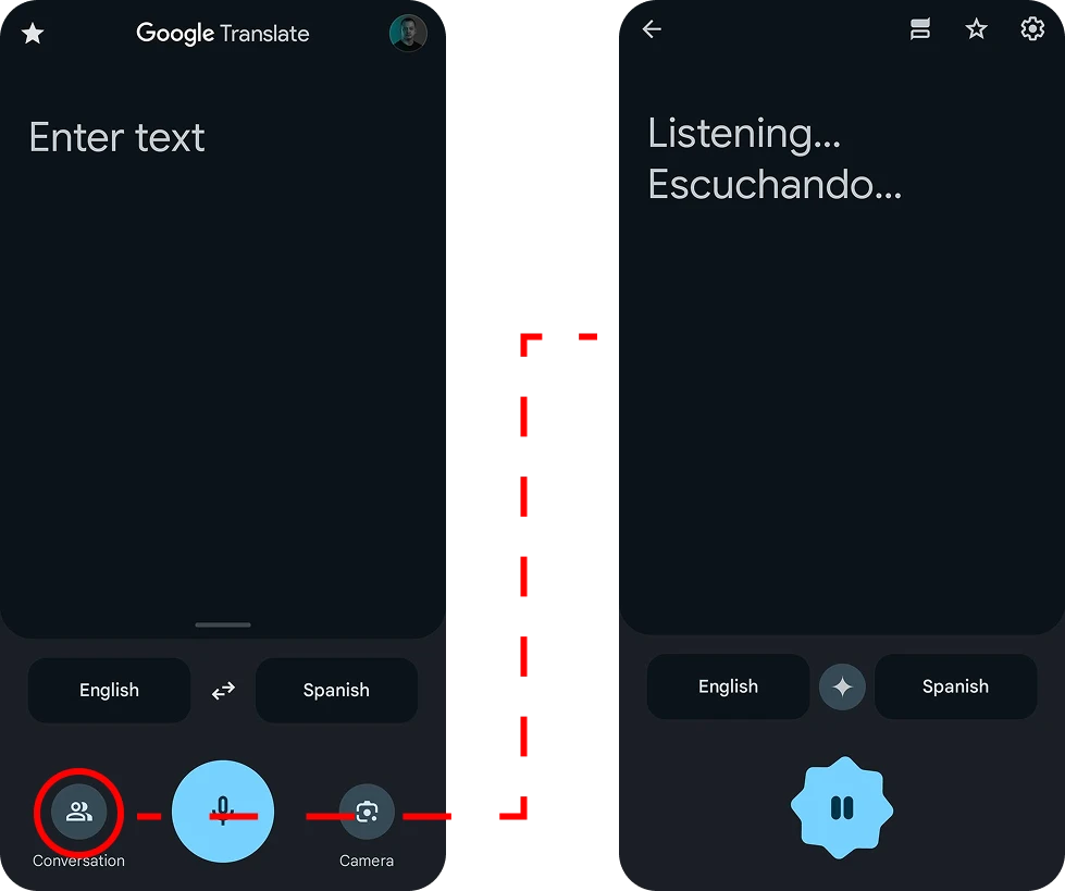
Before designing anything I mapped what already exists. Conversation mode runs on a single device, so people pass a phone back and forth. It keeps no history, so nothing said thirty seconds ago informs what gets translated now. And it holds no context between phrases, which is precisely where the errors come from. Three gaps, one root: it treats a conversation as a series of unrelated phrases.
The decision
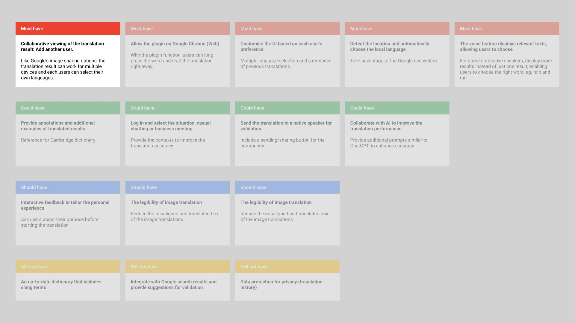
I generated a spread of possible features and sorted them with a MoSCoW analysis. Most were improvements to the single-device flow: faster access, better history, clearer language switching. I chose the one that changed the shape of the thing instead. A shared, persistent room that several devices join at once was the hardest to build and the only one that reaches the root, because a room that stays open accumulates context, and accumulated context is what the translation needs.
Where I was wrong
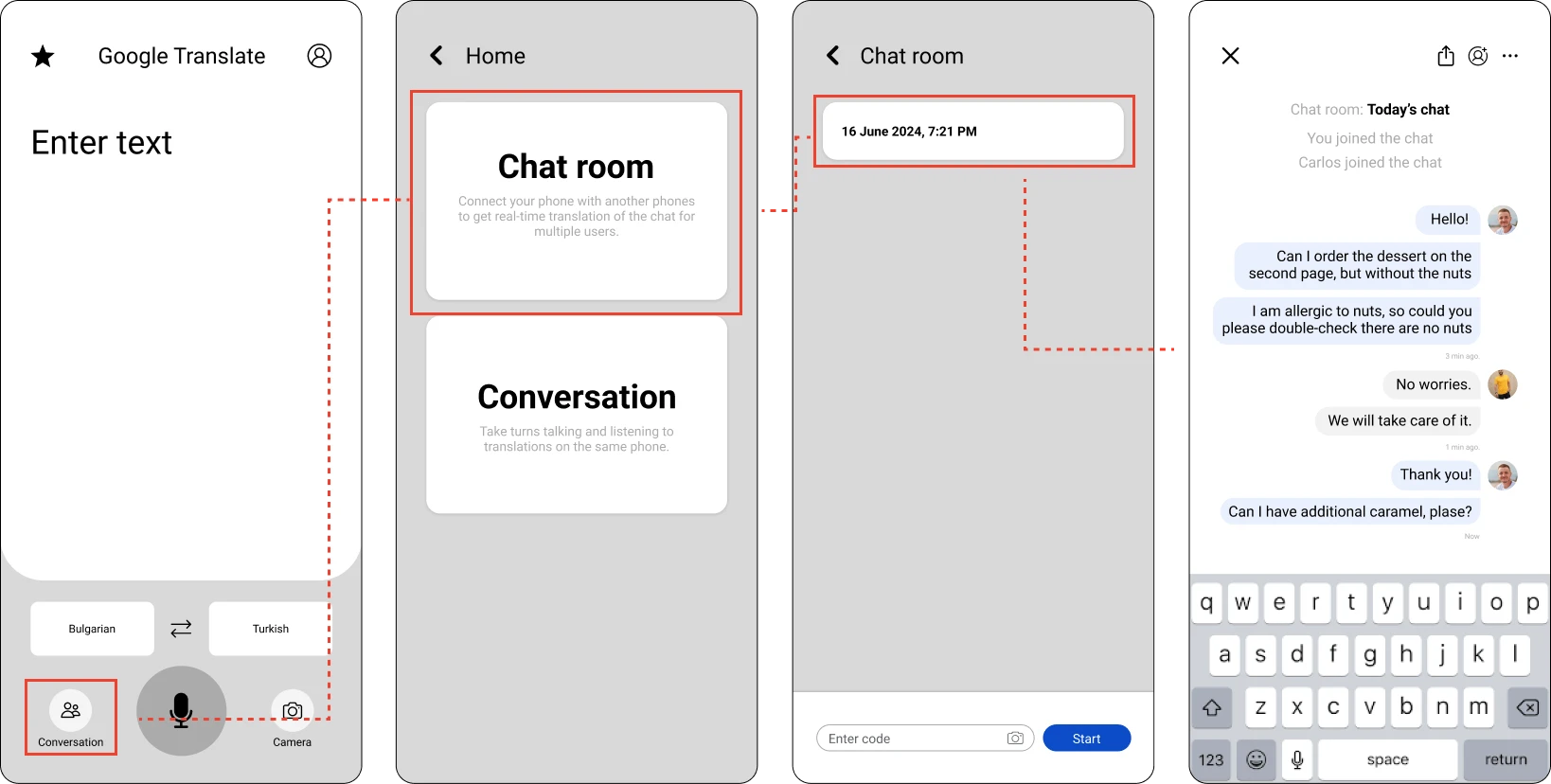
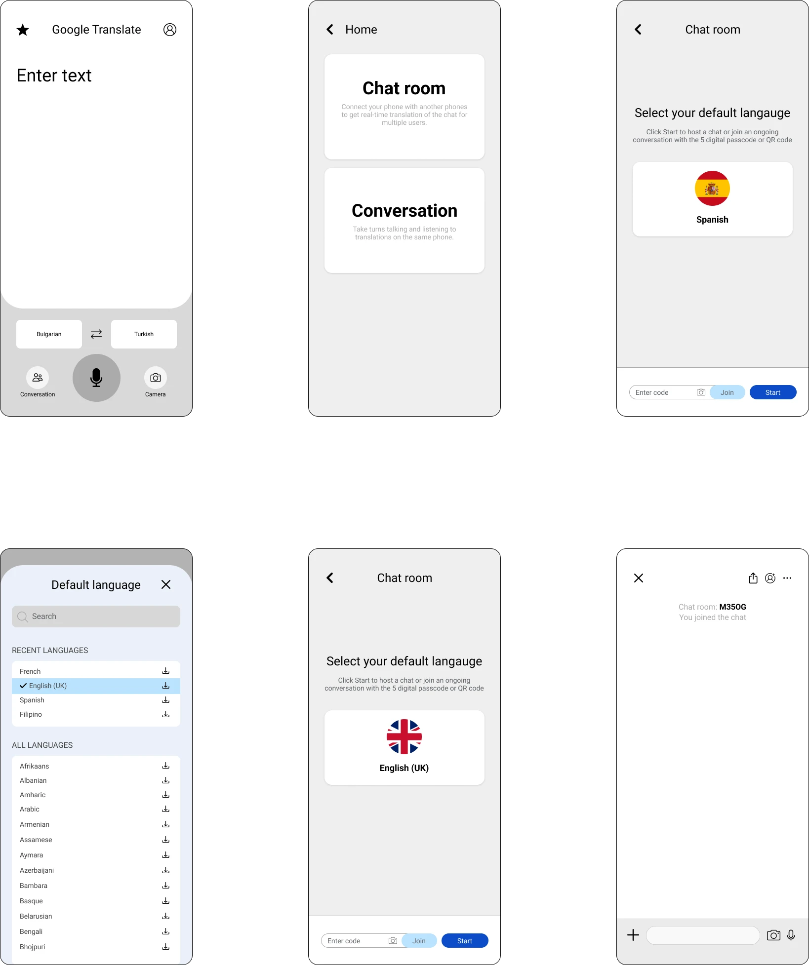
My first wireframes assumed people would open the translation history to read what the other person had said. It seemed obvious to me. Nobody did it, not once in testing. History was somewhere you looked up your own past translations, not somewhere you went mid-conversation to read someone else's. The mental model I had built the flow on was mine, not theirs. That sent me back, and what came out the other side was simpler than what I started with: not a feature buried in history, but a room. People talk, everyone reads it in their own language, and it works across separate devices. Joining happens by QR code, passcode or email invitation.
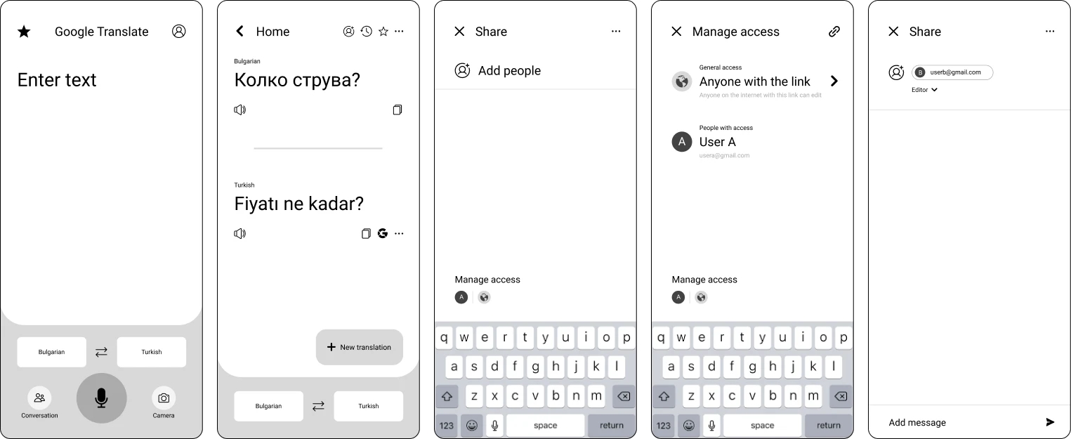
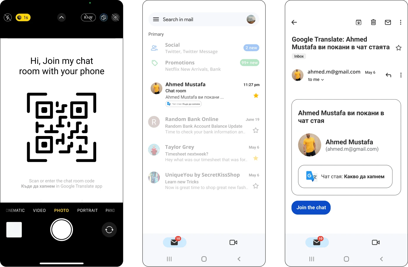
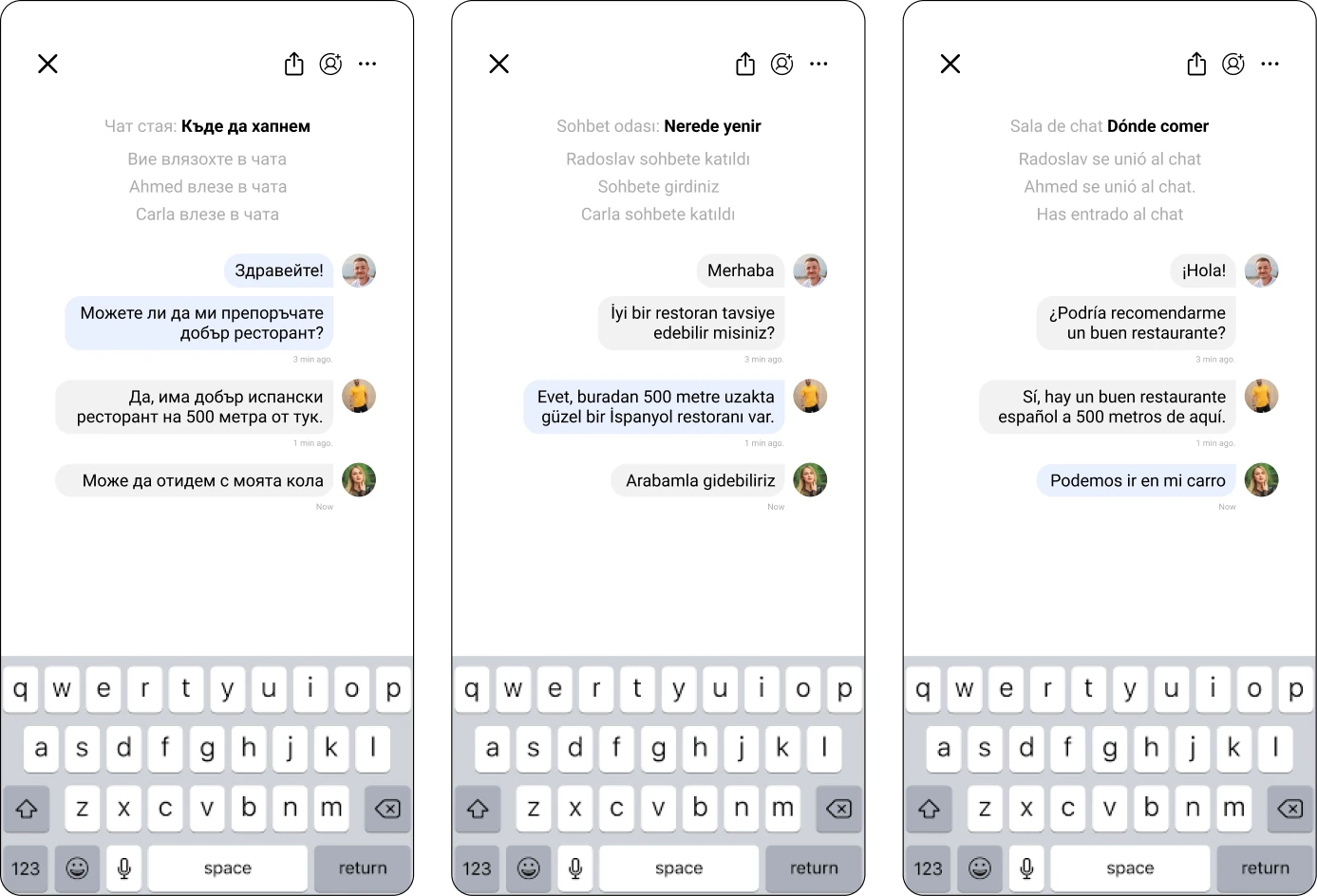
The room, and the ways into it.
The split
A/B testing produced an even split on whether to show the original text next to its translation. Half wanted it and were using the app to learn the language. Half found it noise and only wanted to be understood. Both were right about their own use, so the split was the finding rather than an obstacle to it. The answer became a single toggle: one mode shows the translation alone, the other shows the original and the translation together. It costs one tap and removes the need to be right about which half matters more.
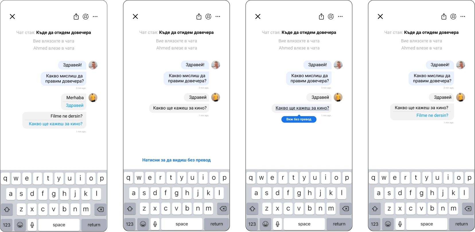
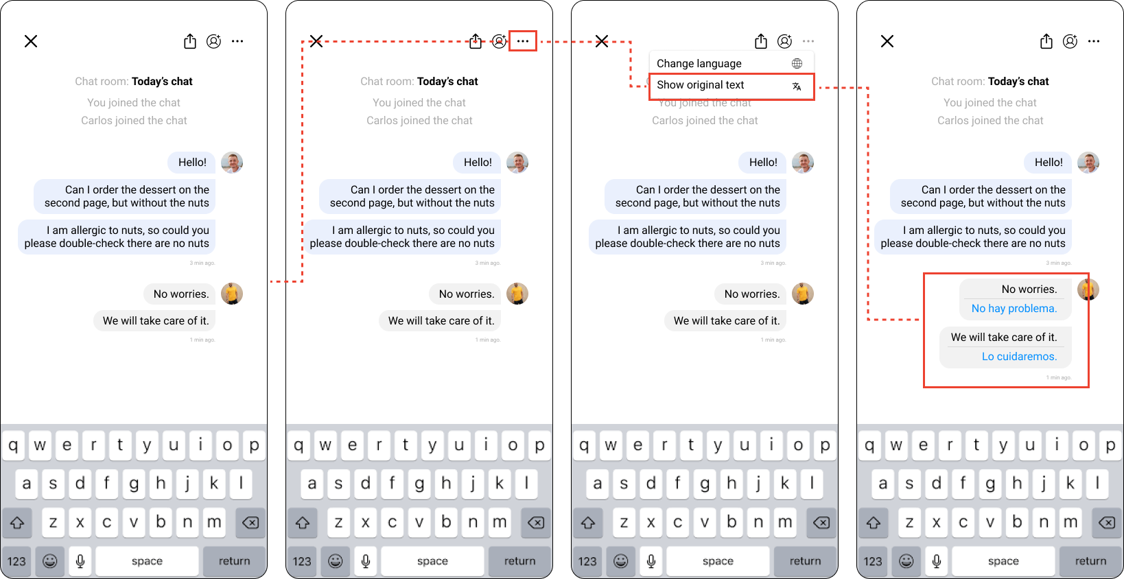
Closing the confusion
Testing surfaced a second problem: people could not tell how the room differed from the Conversation mode already sitting in the app. Two features that look adjacent and are not. I added a screen that states the difference up front, and moved the new feature into a part of the app people already pass through, so they meet it rather than hunt for it.
What testing showed
- 0182% would recommend the feature.
- 0260% expect to add people by QR code.
- 0340% prefer the combined version with a toggle for the original text.
- 0440% were unclear how the room differs from the existing conversation feature.
- 0560% found the route from the room back to the homepage too long.
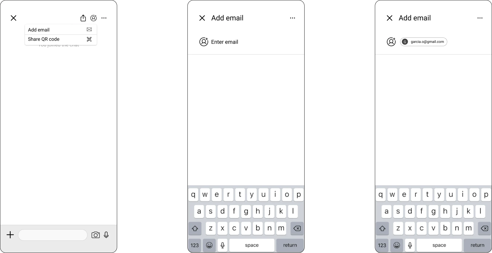
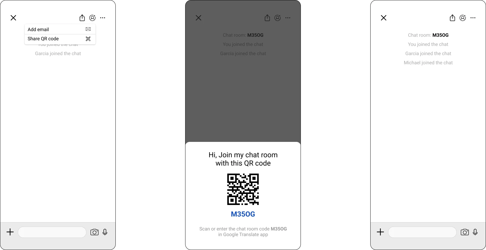
Inviting guests by email, and by QR code.
Where it stands
This is a concept. It was never built, so there is no usage data behind it, and the strongest claim I can make is that the reasoning held up under testing with a small group. If it shipped, the thing worth measuring would not be satisfaction. It would be whether accuracy actually improves as a room accumulates history: the same phrase translated cold, against the same phrase translated after twenty exchanges. That is the assumption the whole project rests on, and it is the one prototypes could not test.