Connect+
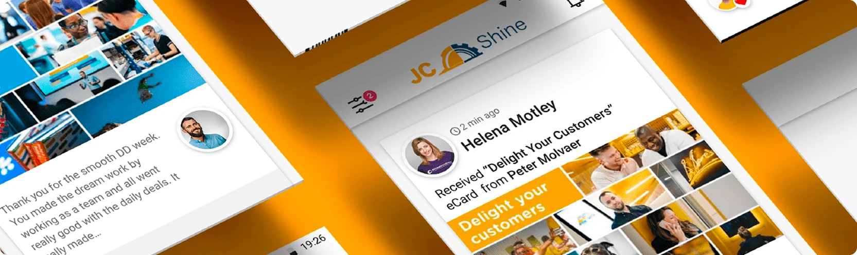
An in-house redesign of an employee appreciation platform: fewer steps to send, less clutter to read.
Overview
An in-house project to improve our existing platform for appreciating colleagues through eCard sharing. Two areas carried the work: the process of sending an eCard, and the user profile.
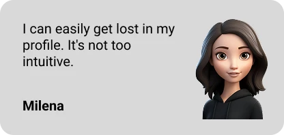
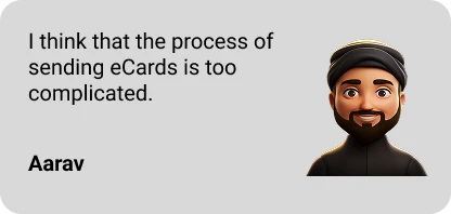
Surveys and user interviews.
What came back
- 01Complexity. Sending an eCard takes too long and asks too much.
- 02Limitation. People feel restricted in personalising a card enough for the appreciation to read as genuine.
- 03Clutter. The profile is busy, so what matters is hard to find and harder to prioritise.

Before
The old sending flow looked dated and cost too many clicks. The profile was disorganised enough that people got lost in it. Hard to navigate, hard to find the relevant details, and that fed straight back into how usable the whole thing felt.
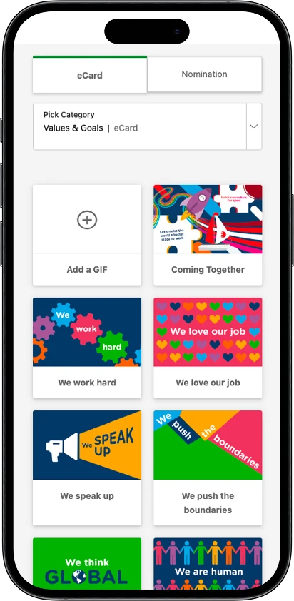
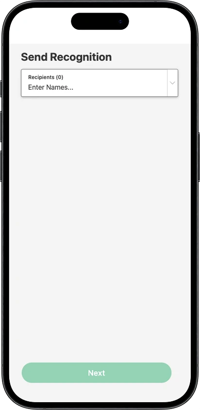
Before: sending an eCard.
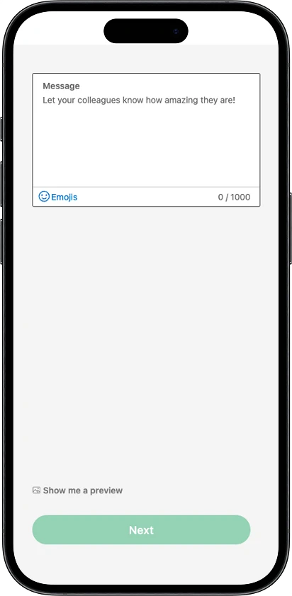
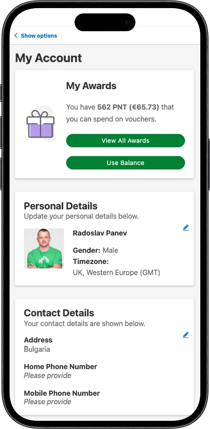
Before: the rest of the flow, and the profile.
After
The number of screens came down: pick a colleague, write the message, done. A preview button lets people check the recognition before it goes out, and the emoji section became far more prominent.
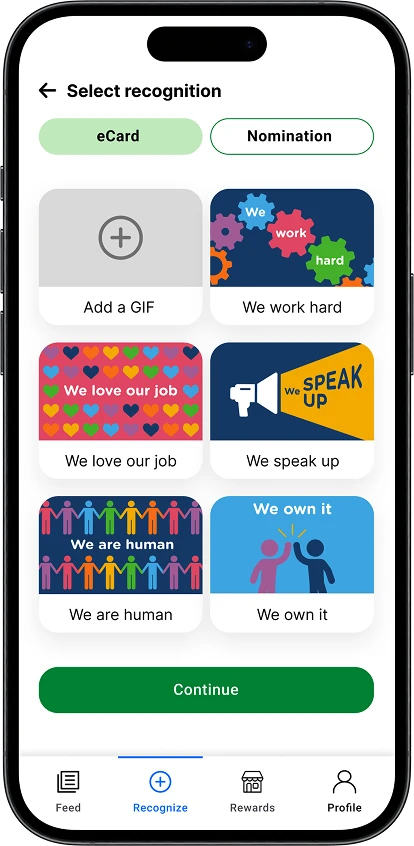
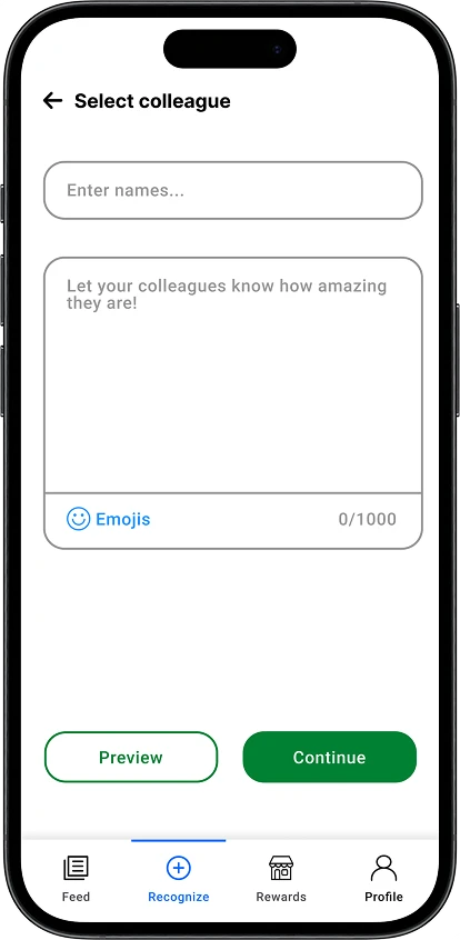
After: sending an eCard.
After: the profile
The essential details now sit where people look first. Balance points appear directly under the name and are spent through a Use balance button, instead of being buried somewhere further in.
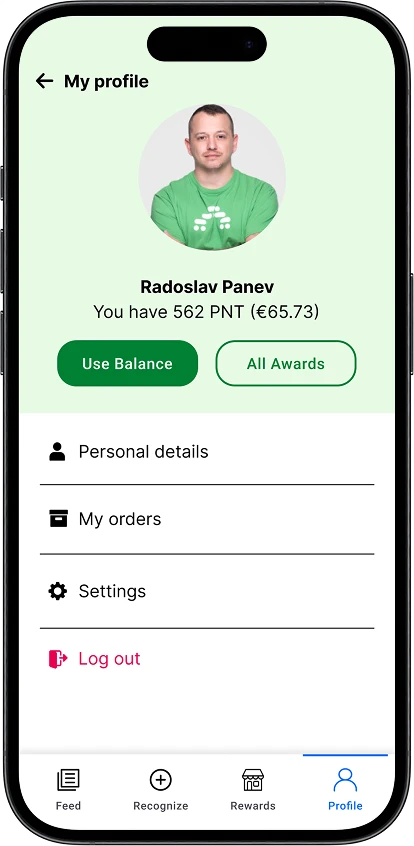

After: the profile, and the wider set.